All taxes included. Free worldwide shipping. No hidden fees.
James Ward
Couldn't load pickup availability
Quantity
Free Worldwide Shipping
Ships in 2–5 Business Days
30-Day Quality Guarantee
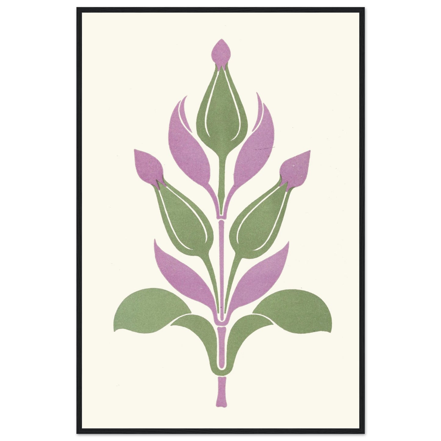
James Ward taught at the Dublin Metropolitan School of Art and mentored a generation that included Harry Clarke and Seán Keating — these colour studies were teaching tools as much as artworks, built to demonstrate how specific hues behave next to each other.
Sizes & Format
30 × 45 cm / 12 × 18″
60 × 90 cm / 24 × 36″
Available framed in black, white, wood
Print & Frame Details
Archival matte paper, 250gsm (110lb), acid-free and FSC-certified — off-white, uncoated. Framed prints: solid oak or ash wood frame, 20mm thick, with shatterproof protective glazing. Ready to hang, hanging kit included. Unframed prints up to A4 ship flat; larger sizes ship rolled in a protective tube.
Free Worldwide Shipping
Framed prints are packed with protective corners and wrap, boxed with reinforced edges, and braced with internal supports for extra rigidity (max 3 frames per package). Every order ships free, made to order and delivered from the hub closest to you: Ireland 3–7 business days · UK 4–8 · USA 5–10 · Canada 6–12 · Australia 7–14.